
Heriage Real Estate
Brand Identity and Creative Direction
Property Advisory · Private Markets · Switzerland
A considered brand identity for a Swiss property advisory operating in private markets.
Heriage is a Swiss property advisory specialising in the discreet placement of exceptional residential and investment assets across Switzerland. Operating at the intersection of trust, discretion, and international reach, Heriage advises private clients on high value property decisions where judgement, structure, and long term perspective are essential.
The Brief
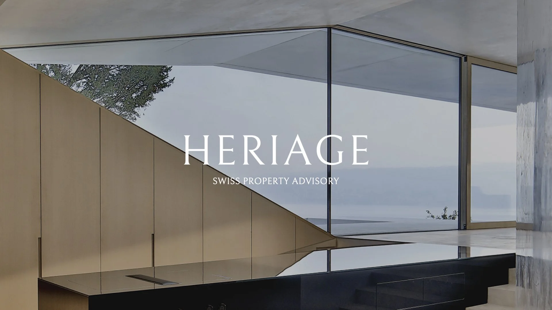
Heriage is a Swiss property advisory operating in private luxury markets, advising clients on significant property transactions with discretion and judgement. Define London was engaged to craft a brand identity that communicated trust, expertise, and restraint the qualities that define how Heriage operates in a sector where reputation is everything.
The Challenge
Real estate branding is saturated with visual clichés gold accents, generic skylines, and overworn luxury tropes. Heriage needed something different: an identity that signalled authority and credibility without resorting to the visual language every competitor uses. The challenge was to design a mark and system that felt timeless from the moment it launched, built on restraint rather than decoration.
The Strategy
We built the strategy around a single principle: discretion as a design value. Heriage's clients don't want flash they want confidence. The brand needed to feel like a quiet, assured presence in the room. Every design decision was tested against one question: does this communicate trust and judgement, or does it simply add noise?
The Solution
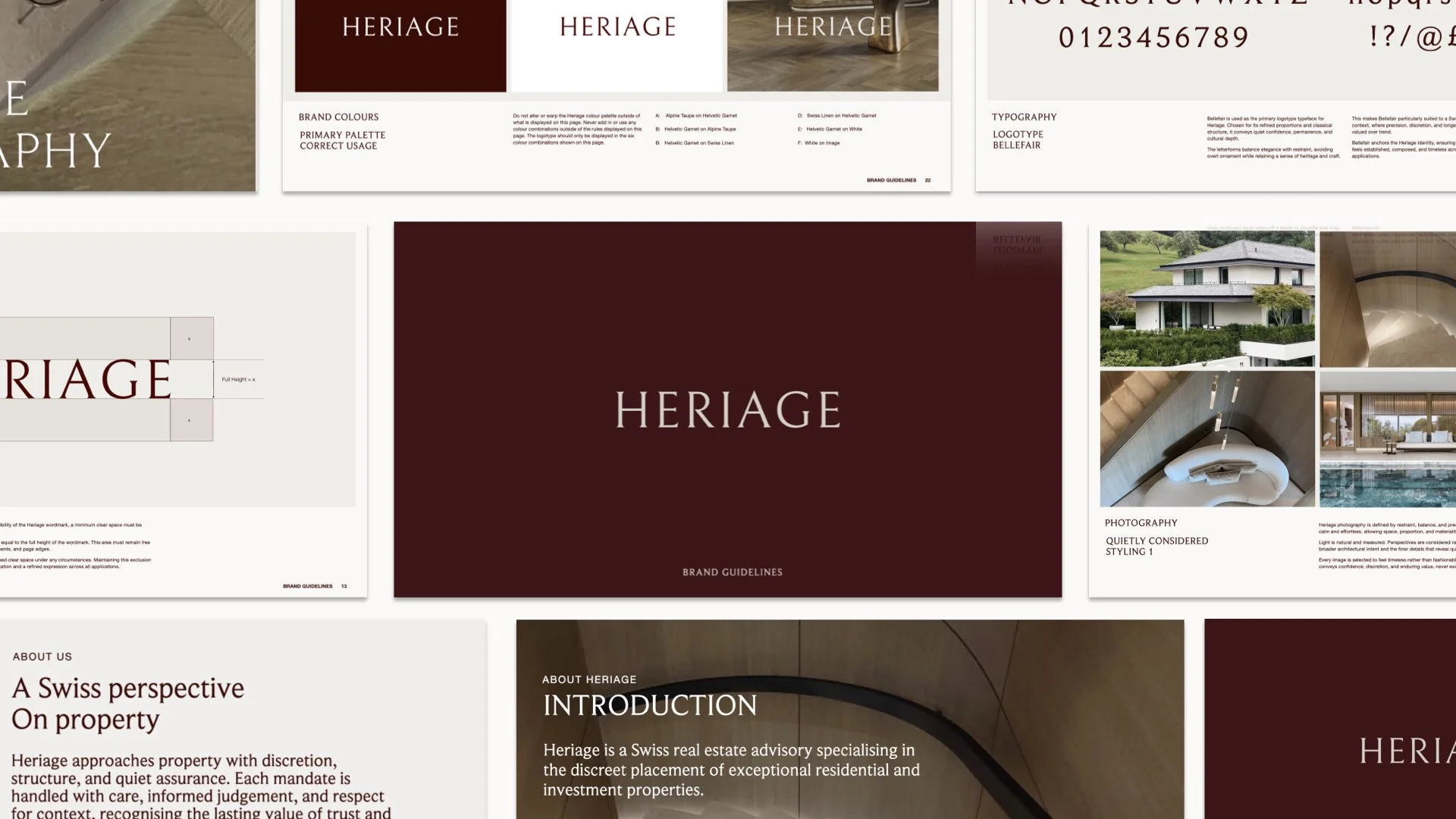
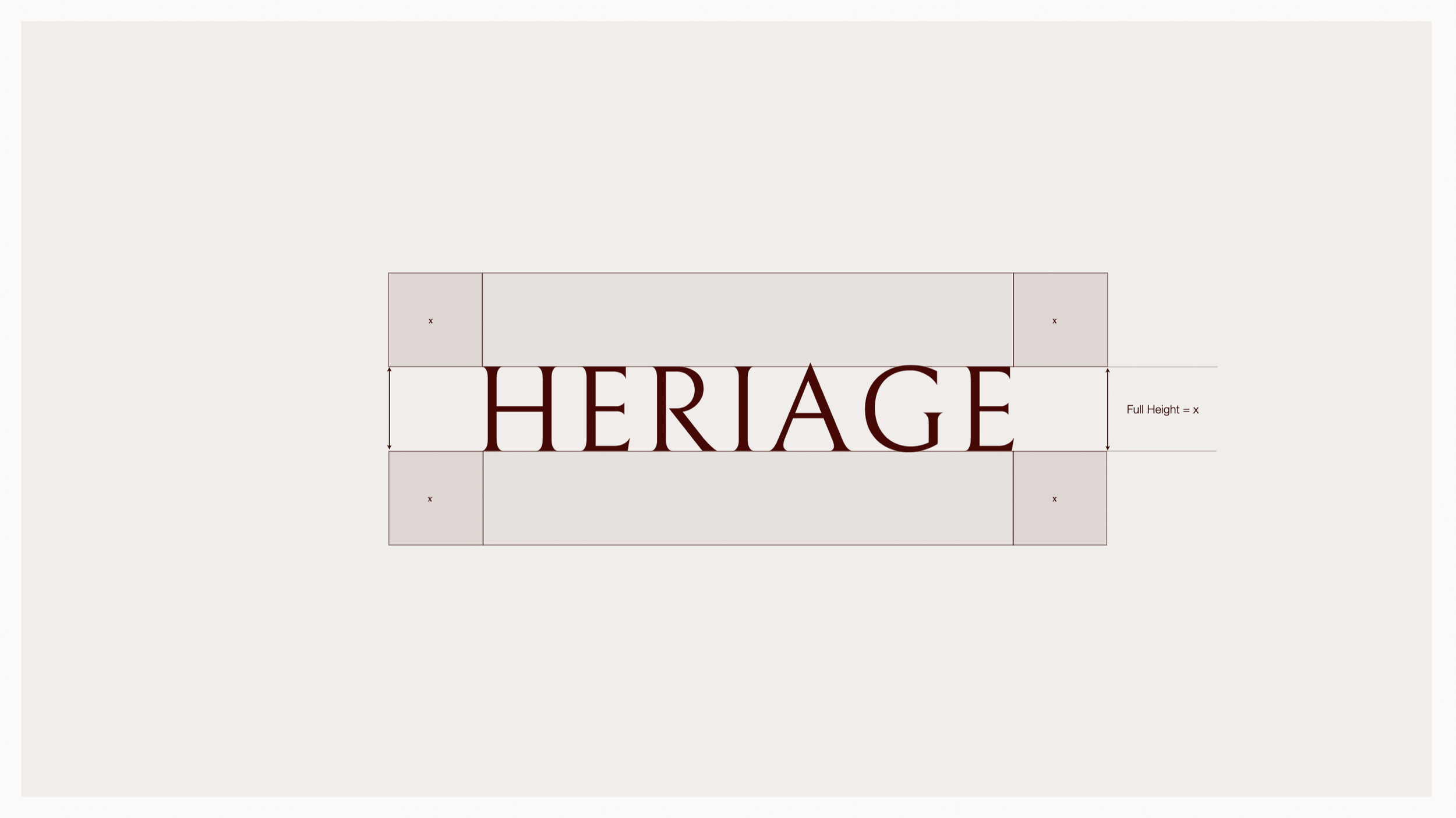
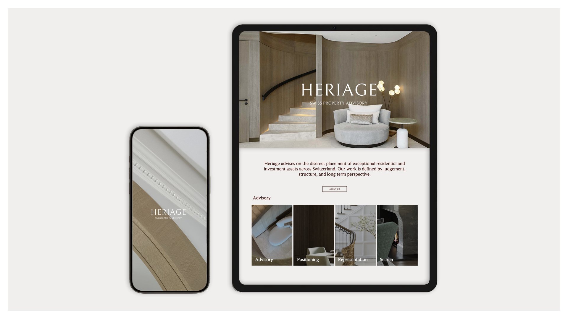
The identity system was built on restraint and clarity. The mark itself was designed to feel timeless a wordmark with considered proportions and a typographic system that conveyed precision without ornamentation. The colour palette was deliberately restrained, using a muted, sophisticated range that felt appropriate for private advisory work.
The system extended across:
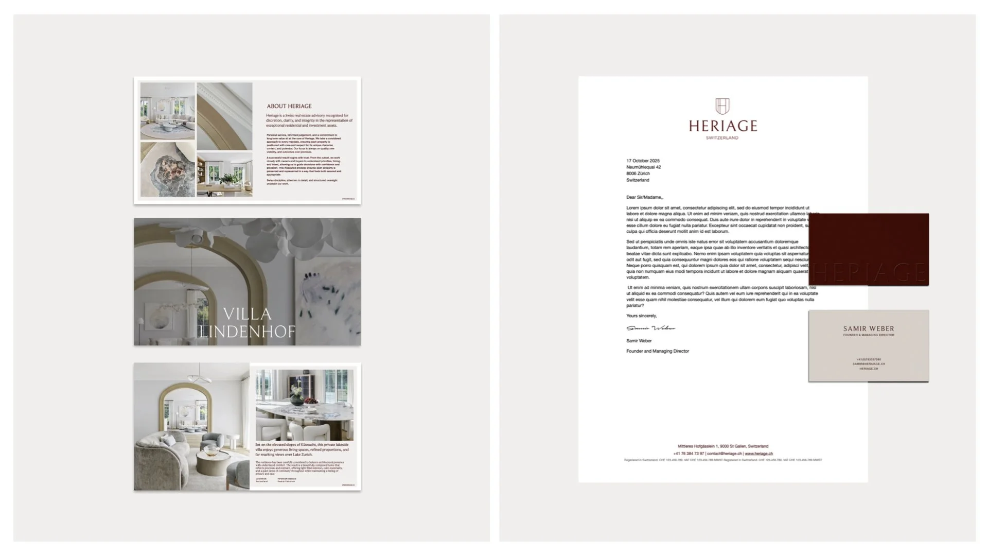
Brochures: Property documents and advisory materials that communicated value through layout, typography, and quality of production rather than visual embellishment
Signage: Environmental applications for Heriage's offices and associated properties
Digital: A web presence that matched the quiet authority of the print system
The typographic system was a central element selected and configured to communicate trust and judgement at every size, from business cards to building signage.
The Results
The identity gave Heriage a presence that felt established from day one, a brand built on clarity and restraint that communicated the firm's core values without needing to state them explicitly. The system's timelessness ensured it would remain relevant as the business grew, without requiring rebranding or visual evolution.
Explore more: Our Services | About Define London | Selected Work