Building a Brand for Discretion | Heriage Real Estate
A considered brand identity for a Swiss property advisory operating in private markets.
In private markets, the brand is rarely seen and that is exactly the point.
When Heriage, a Swiss property advisory specialising in the discreet placement of exceptional residential and investment assets, approached Define London, the brief was not about visibility. It was about credibility. The identity needed to feel quietly confident, precise, and globally fluent without relying on familiar luxury cues or regional clichés.
This is how we built it.
See the full Heriage case study→
The Context
Heriage advises private clients on high-value property decisions across Switzerland, where judgement, structure, and long-term perspective are essential. Operating at the intersection of trust, discretion, and international reach, the advisory required an identity that communicated value through restraint rather than decoration.
The challenge was specific: articulate a visual language capable of supporting both residential and investment advisory work, while remaining understated and disciplined in tone. The identity needed to feel established and authoritative from the outset, reinforcing confidence in high-value decision-making rather than drawing attention to itself.
Longevity was central to the brief. Every element needed to withstand time, market cycles, and evolving client relationships.
The best property brands do not chase attention. They earn it through structure and restraint.
The Approach
Define London led the brand identity strategy and creative direction from inception, developing a cohesive and enduring visual system that could support advisory, positioning, representation, and search across the business without noise or excess.
Restraint as strategy. Decisions around typography, colour, layout, and imagery were guided by clarity. The identity was designed to communicate value through judgement rather than decoration.
Avoiding the expected. Swiss property branding often leans on alpine motifs, gold accents, or overt prestige signals. We deliberately avoided these. The visual language needed to feel internationally fluent — relevant in Geneva, London, or Dubai — not regionally specific.
Longevity first. Every element was selected for endurance. The colour palette, typographic system, and layout grids were chosen not for trend but for permanence. An identity built for private markets must outlast the market itself.
Two audiences, one voice. Heriage serves to both residential buyers who are seeking exceptional homes and institutional investors seeking structured opportunities. The identity needed to feel equally credible to both. Warm enough for personal decisions, disciplined enough for institutional ones.
What We Delivered
The work focused on establishing a clear foundation across every touchpoint:
Brand identity strategy and creative direction — positioning the advisory within the Swiss property market as a credible, assured presence
Visual system — typography, colour, layout, and imagery guidelines built on restraint and precision
Print applications — stationery, brochures, and property materials that feel substantial in hand
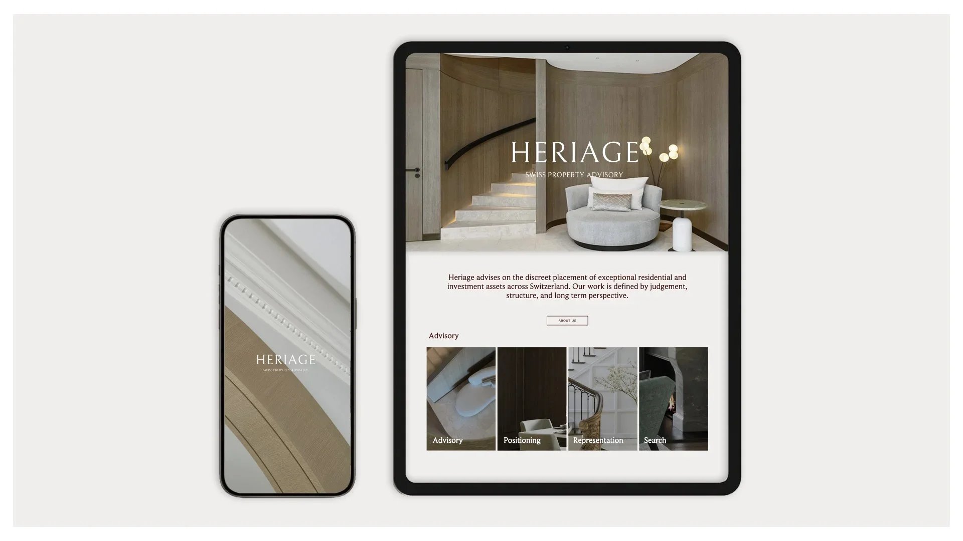
Digital presence — website direction and online communications that translate the brand with clarity
Environmental considerations — signage and spatial brand applications for physical environments
What We Learned
Discretion is not anonymity. The most effective private-market brands are those that signal credibility before they signal scale. Every design decision for Heriage was made with the understanding that the client discovers the brand through referral and reputation, not advertising.
Property branding for private markets requires a different rhythm. Slower, more considered, built on trust signals rather than volume. The identity must feel like it has always existed even on day one.
Structure communicates value more effectively than any decorative flourish. The typographic system, the spacing, the proportion of elements on a page, these are the signals that tell a client this advisory thinks in terms of precision and permanence.
The most enduring identities are those designed to be invisible at first glance and unforgettable on second look.
The Result
The resulting identity positions Heriage as a credible and assured presence within the Swiss property market, aligned with private clients who value discretion, structure, and long-term thinking. Designed as a foundational system, the identity supports consistency across digital and printed communications while remaining flexible as the advisory continues to grow.
It does not shout. It does not need to.
If you are building a brand where discretion is the strategy,we should talk.
Written by the Define London studio.